Major Project
Creating work-life balance for young remote employees [Read more]

Overview
For my final major project, I researched the problems of young remote workers with a focus on the lack of detachment. The outcome aims to optimise their productivity during their working time and provide inspiration for activities to do straight after work to enable self-actualisation during their free time.
Flowo is for everyone who feels like there is no real free time between their working-from-home days. It restores the daily hour saved from the commuting after work and converts it to a moment to blow off the steam and feel better.
Flowo will:
1. Provide timely tips to reach the flow again and feel more productive at the end of the working day
2. Predict the daily workflow to facilitate task allocation
3. Recommend to stop at productivity lows
4. Show information about the community stopping to work as well
5. Suggest activities that can make you feel better
6. Display clear benefits for each activity (with a focus on the stress level)

Challenge
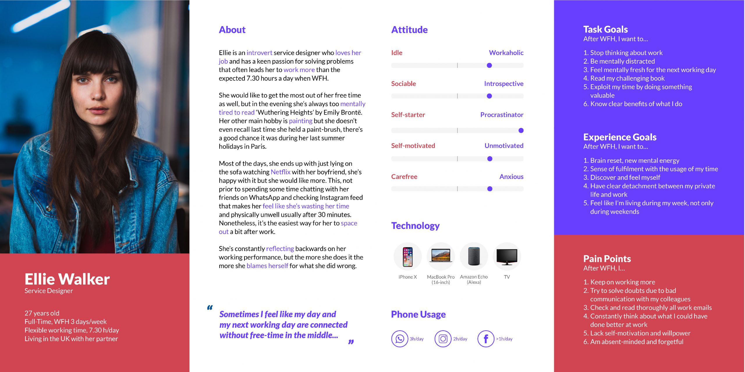
Working from home is becoming the new normal in a post-lockdown world, research suggests it may lead to exhaustion and burnout because people struggle to unplug from work. As evidence, remote employees work on average four extra hours each week. Understanding all smaller issues that contribute to the feeling of time deprivation and exhaustion when working from home was crucial to convey a user experience that would have a real impact on their daily life. The aim of this project is to avoid overworking due to guilty feelings and make users feel worthy to live a real free time in which they can feel fulfilled.

Discovery
Due to Covid-19 limitations, primary research was conducted online to gain deep qualitative insights into young (25-30 years) employees struggles and attitudes toward remote working. Half of the participants were new to this condition, while half had already experienced working from home. This factor was extremely useful in terms of the variety of insights and provided two different at once similar perspectives on the detachment problem. Another factor considered for participants triangulation was the degree of introversion of participants. Eventually, target users were narrowed down to introverts because extroverts demonstrated to partly solve the detachment issue by socialising.
Methods included:
• Diary studies were conducted on private pages on Facebook due to participants confidence with the media to gain insights on people's after work but revealed to be not functional to gain deep insights, therefore, it was stopped after one week.
• Semi-structured interviews to test their level of satisfaction, and detecting any best practice in detaching from work.
• Letter studies to avoid self-justification detected in previous methods.
• Online card sorting into self-improvement areas and the value they assign to free-time activities to identify patterns for improving their free-time usage.
• Second diary study to be completed every 15 minutes after work to gain insights into mental energy levels.

Synthesis
Data collected were analysed using affinity diagramming, thematic analysis, and quantitative analysis. Key insights inlcuded:
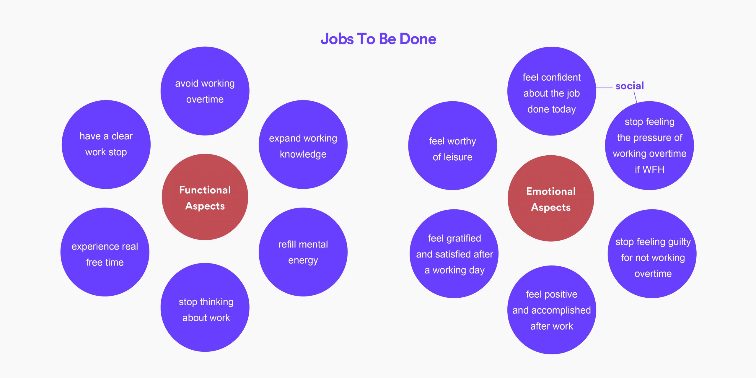
• Young remote workers cannot disconnect and have a healthy detachment because the sense of satisfaction of stepping out of the office is missing.
• Young remote workers lack the inner strength to stop thinking about work issues that were not solved due to bad communication with colleagues during business hours.
• Young remote workers want to refill their mental energy but would like to expand their working knowledge at the same time, nevertheless they end up in wasting time on social networks because they lack self-motivation.
A key quote was:
"I miss closing my laptop and stepping out of the office. I feel like there is no free time during my work from home days."

Ideation & Definition
After defining a project direction my first approach to the chosen opportunity statement was to diverge as much as possible. The secondary research included ways to create satisfaction, mind relaxation and detachment techniques, as well as physical detachment, and existing trends. The how might we statements lead to 13 initial ideas that were evaluated against a validation matrix and 8 target users were involved for feedback on the first five.
The idea preferred by users consisted of an app suggesting free-time activities with the possibility to create accountability with someone. Among other problems emerged from users' feedback, this idea did not address the 'guilt' problem. This idea was integrated then with one that would have acted on the working time inspired by the Sleep Cycle app whose features will be translated into workflow analysis and timeslot to stop working smoothly.

Implementation
After preparing the initial wireframe of the app for the onboarding, interactive dashboard and activity choice from the mobile app, the prototype was iteratively tested through video calls with target users. This phase aimed to overcome researcher biases, verify expectations for some key features, and test the comprehensibility of UI elements, and lo-fi parts were converted gradually into hi-fi to ensure continuously the usability of screens.

Key Features, Dashboard/Smartwatch
Users will go through an onboarding process in which they will be assigned to a community based on their working area, age range, and the time slot they would like to get the habit to stop working. Here are three innovative elements of the desktop app:
1. The main graph displays the current level of productivity, as well as the estimated one to let the user allocate harder tasks to exploit productivity peaks. Insights are constantly updated on the dashboard, including 'energy left' and 'stress level' collected by the smartwatch.
2. By selecting 'anti-social' from the dashboard (bottom-left) or the smartwatch, a provided plug-in sets a status on WhatsApp (or other chat systems) communicating unavailability for social activities. This will allow users to recharge alone, and avoid feeling trapped in social situations after work.
3. When Flowo detects a low in productivity, it will display tips to reach the flow again. In case this low happens around the end of the working time, the user will be suggested to stop working. Seeing people in the community leaving and starting leisure activities on the right of the screen will limit guilty feelings (social proof).

Key Features, Mobile App
The mobile app intended for use after-work includes information on the level reached in each area of interest. Here are three main features of the mobile app that is worth mentioning:
1. The choice of representing macro-areas of interest with the highest level achievable in that area (e.g. ‘Athlete’ for sport category) is about self-actualisation, to give users the possibility to become what they want to be, not only to fill their free time. Levels corresponding to new activities unlock were added to make the progress easy to see and boost their intrinsic motivation. Please note there is no control over the user to avoid making them feel monitored – pain point – and build mutual trust between the user and Flowo.
2. Clear scientific benefits are always on evidence, both for the area and the specific activity suggested. In response to the user research, these benefits focus on the stress level decrease in the community and for the user if not new to the area.
3. After accepting an activity suggested by Flowo in the chosen area, the user can set a timer for getting ready accompanied by energising music played automatically by Flowo. This function avoids procrastination and boosts motivation as randomness in music has been linked to increases in dopamine.
Claudia Sabbadin
A curiosity-driven facilitator who loves designing useful and usable products, anticipating problems, always updated on UI trends.
I come from Italy and I have a first degree in Industrial Design. As a designer, I combine what I constantly learn about UX with my graphic skills to convey user needs and pain points into pixel-perfect user interfaces. I always keep a focus on ideating concepts that might have a real impact in the real world to improve people lives considering the feasibility throughout the whole design thinking process.
My teammates usually value me for helping them with constructive feedback and making sure everyone is on the same line seeing the big picture of the teamwork. Thanks to my good time managements I ensure deadlines are respected to leave time in hand for polishing what will be presented to a potential client.
In the next few years, I plan to gain as much experience as possible in both UX and UI design. Meanwhile, I aspire to work on many projects centred on mental health improvement, especially for younger users.
Major Project
Creating work-life balance for young remote employees
Awards
In November 2019, I participated in a one-day event held at Loughborough University, in collaboration with Hong Kong University MBA students and Deloitte Digital. As a group of five people with different backgrounds, we were commissioned by Medirecord (our client) a patient-centric data crowdsourcing platform, using data analytics, to help demonstrate the effectiveness of evidence-based treatments and their combinations for cancer patients. Our group was awarded 'UXathon19 Best Branding'.
In June 2020, a project I worked on for about three months with five UX students was awarded the second prize at 'Smart Mobility Challenge 2019/2020' promoted by Ford Motor Company Fund. Our project 'Ubag' aimed to create a hand-free journey for travellers with a luggage delivery system based on the sharing economy. The app included a live tracking and review system to address the security problem.