Major Project
Enhancing the experiences of young refugees who are new to a… [Read more]
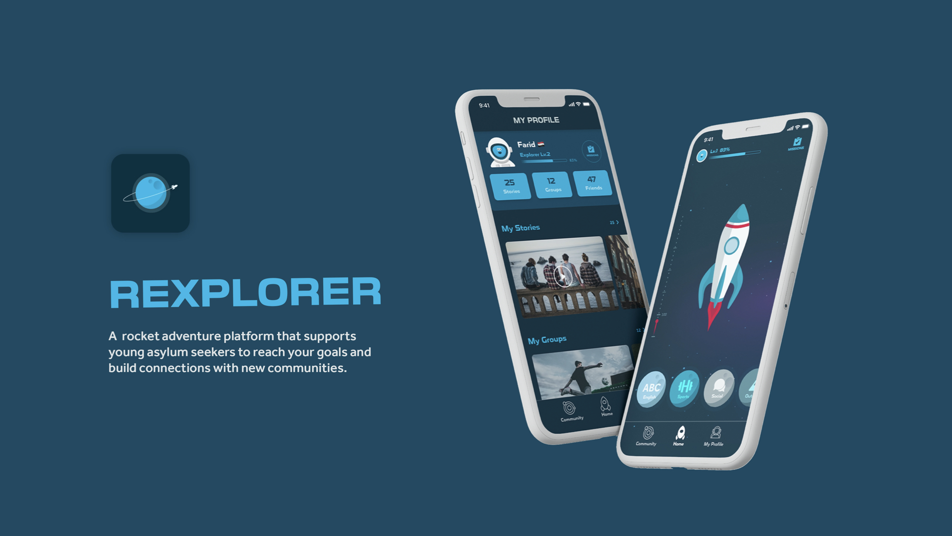
A rocket adventure platform that supports young asylum seekers to reach your goals and build connections with new communities
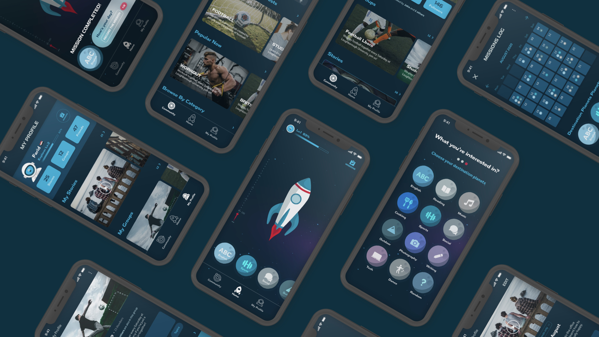
Rexplorer is a rocket adventure game and social platform that supports young asylum seekers who came to a new community to reach their goals of learning new things or building habits by record the daily progress with small missions. The community platform provides various positive stories and groups created by people with similar interests, and it is a safe space for young people to connect and interact with each other.
The challenge
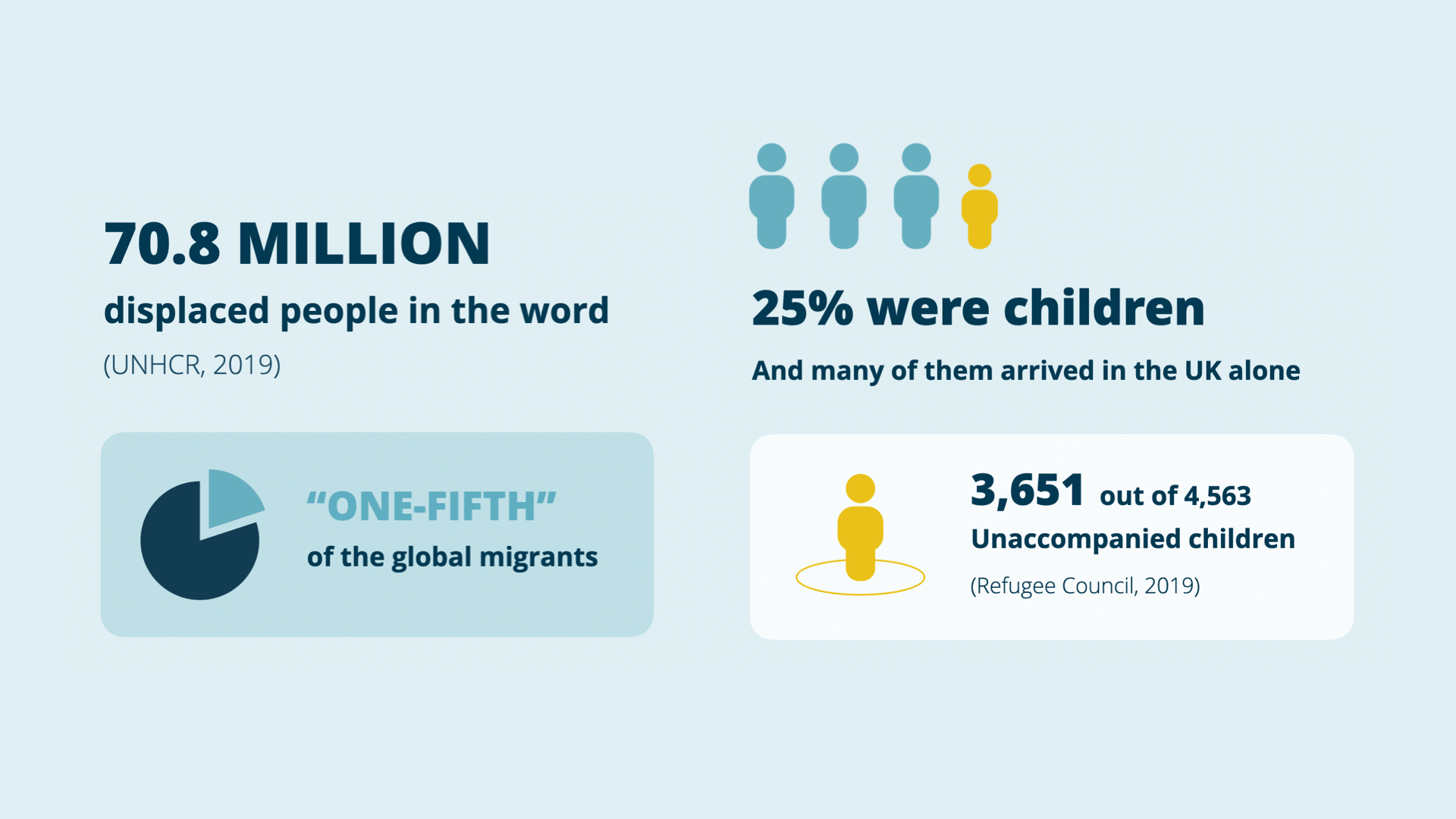
According to the statistics, there are more than 70 millions of displaced people, which was one-fifth of the global migrants in 2019.
In the same year, more than a hundred thousand asylum seekers arrived in Europe, mostly by sea.
Compares to other countries, the UK wasn’t the home of many asylum seekers.
But, it is worth noticing that 25% of them were children, and many of them arrived here alone.
User research
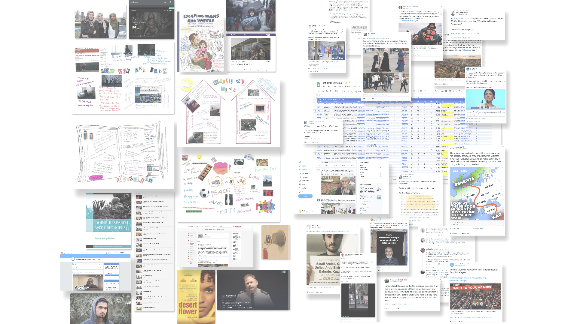
Due to the COVID-19 pandemic, the participant group of the primary research focus on the key stakeholders, social workers and volunteers, who have the experience of working with the young refugees in the UK. In terms of perspectives of the young people, multiple digital research media such as interview videos and published stories were used to fill the gap.
Methods included:
• Secondary research: I collected data from books, documentaries and forums to understand the emotional feeling of refugees and the challenges they met. I also used digital footprints to review the user-generated data via social media and videos.
• Semi-structured Interviews: 8 remote interviews with charity workers to understand the challenge and needs of young refugees through their observation and experience.
• Auto-ethnography: Before lockdown, I joined the volunteer team and involved in a few activities to put myself into the environment and interact with young people.
• Social media scraping & Digital footprints: To understand local people’s awareness and perspectives about refugees.
Key insights
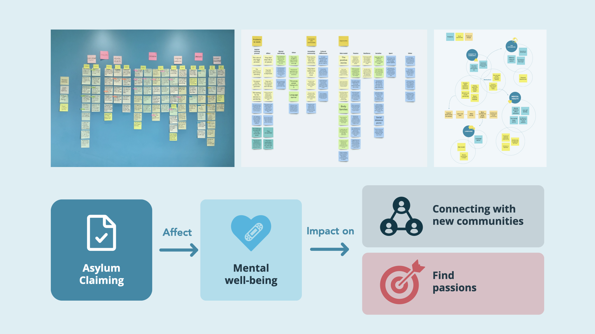
Data were collated and analysed using affinity mapping. Key insights included:
• Many of the young asylum seekers feel depressed, anxious, and unmotivated due to the uncertainty of the asylum claiming process.
• Many young people want to fit in the new community but struggle to catch up with others in the same age.
• Personalities and needs vary, some people are quite open, but some people just want to stay with the people they knew
Design iteration
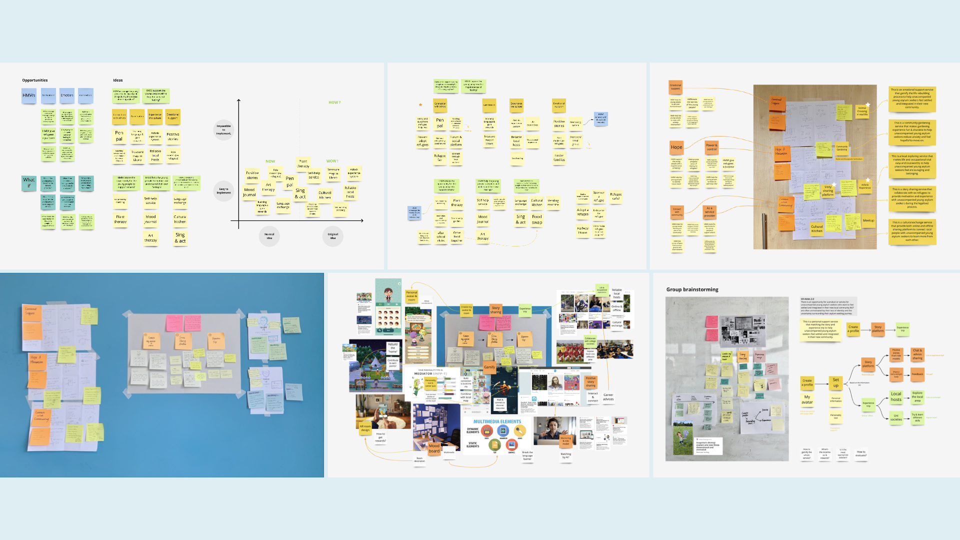
In response to the chosen UX vision statement, some of the stronger HMWs from the opportunity matrix were developed into numbers of concepts. I used different ideation tools to generate and evaluate ideas for potential solutions
Co-design
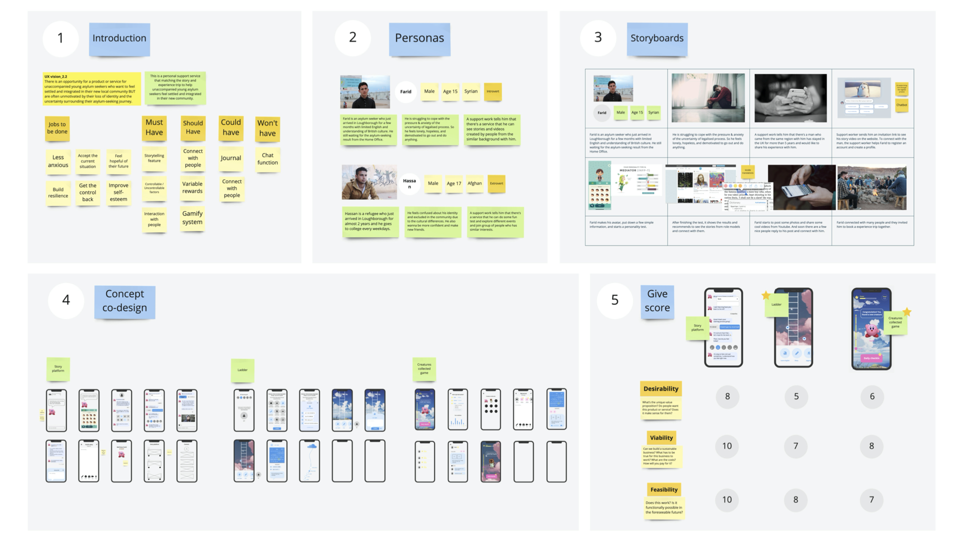
To define the concept direction, I recruited 7 participants which include 5 charity workers to run co-design workshops. The workshops were conducted on the online platform for quicker communication and collaboration. I introduced the project and the storyboard briefly, and share the visualised concepts with them, and they gave a score for each.

User testing & iteration
There were user testing and usability testing with two iterations.
Luckily, with the support of BACA charity, I managed to do the user testing with two asylum seekers. So I asked them to do think aloud while going through the low-fi prototype and it was quite insightful.
In iteration 1, I adjusted the user flows to improve the efficiency of achieving the tasks and also regrouped some features. Iteration 2 focused more on usability issues; I simplified the app structure of the final design to make it easier to navigate with a few steps.
Final design
Overall, it’s beneficial for young asylum seekers to use this product.
With the support of Rexplorer, it is fun and exciting to do meaningful things and connect with people in the new community safely.
The design also meets the UX vision and design principles.
Tsai-Wen Tan
A passionate problem solver who enjoys creating user-centric, beautiful & human experience
I had done my bachelor’s degree in integrated design in Taiwan, where I built up the basic knowledge and sensibilities of graphic, product, and space design. After completing the degree, I had opportunities to work as an intern in a large electronics company doing wireframing and user experience design. Through the six months internship, I have developed my passion and learnt various practical skills of user-centred design with empathy in the real world.
With a keen interest in social innovation, I enjoy improving the well-being of people in need with UX design methods. Coming from the different cultural background, I found I have strong sympathy and different perspective of seeing the social issues in Europe. In the future, I would use my strengths and keep the transformative value in my mind, putting more empathy on people and improve our society with my capacity as a designer also as a human being.
Major Project
Enhancing the experiences of young refugees who are new to a community
Awards
During my study in master degree, my team won the Best Concept Award in UXathon19. The Uxathon is an event hosted by Loughborough University in partnership with Hong Kong University and VANYA. We collaborated with the client in Hong Kong and tried to solve the problems they faced with design solutions.
I was also a member of the winner team of Ford Fund Smart Mobility Challenge. The smart-mobility competition endorsed by Ford Motors is an over 10-week-long event aimed at creating realisable mobility solutions with impact.